
Crimson Graphics • Alton • Hampshire • T: 07866 118275 • E: [email protected]
branding • brochures & flyers • packaging • point of sale • advertising • websites • exhibition display
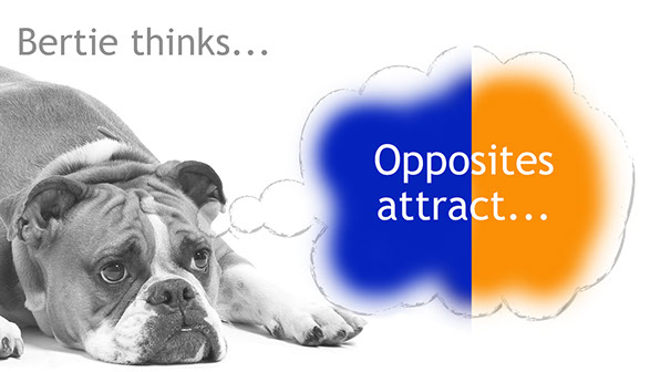
#6 A Colourful Couple...
Last month I wrote about the Pantone colour of the year, to carry on with this subject I want to talk some more about combinations and creating colour relationships with harmony in your designs.
One of the simplest ways to decide if two colours work together is to take a look at a basic colour wheel (click here to try out Adobe’s interactive version) and choose colours which are opposite each other. These pairs have a special relationship, when one is placed next to the other they both appear more intense. Without wanting to getting too technical this is known as Simultaneous Contrast. As they are opposite each other on the wheel they are always a combination of all three primary colours, red, yellow and blue, one colour will be cool and the other warm, therefore complementing each other.
The first complementary pairing I learned at college, and always the one that springs to my mind, is orange and blue. If you love Jaffa Cakes you'll recognise this successful colour pairing. The impressionists were big on complementary colours to create impact. To quote Claude Monet "colour makes its impact from contrasts rather than from its inherent qualities. The primary colours seem more brilliant when they are in contrast with their complementary colours.
So there you go, if you want your design to have impact through colour, find a pair of complementary colours and see how well they work together!
Have our design tips helped you?
Then please follow us on Instagram for all the latest news and tips about our mission to help startup and established businesses to have great branding, flyers, brochures, packaging and exhibition stands!
All content © Crimson Graphics 2025
We do not use Cookies
Click to view our GDPR privacy policy here
Design tips: