Crimson Graphics • Alton • Hampshire • T: 07866 118275 • E: [email protected]
branding • brochures & flyers • packaging • point of sale • advertising • websites • exhibition display
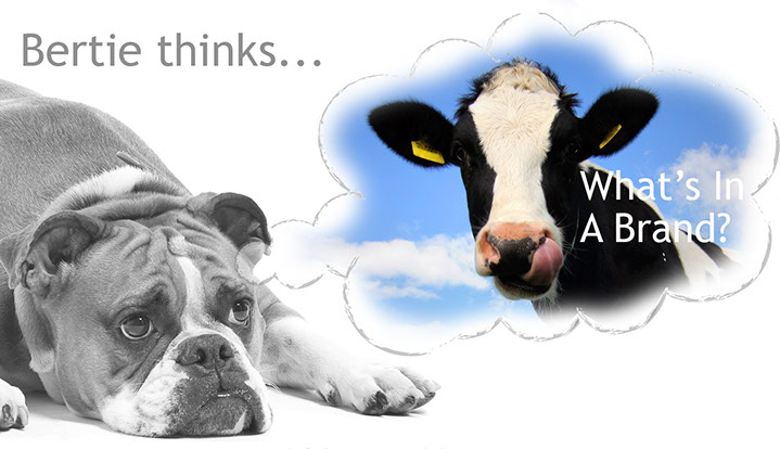
#1 What’s In A Brand?
Branding is one of those overused and sometimes misunderstood terms that gets bandied around. The term ‘branding’ originates from the need for people to distinguish their cows from their neighbour's. To avoid mix-ups over ownership, people began to brand their animals with a distinctive and uniform symbol.
Today, branding your business is a lot less painful if you commission a graphic designer to create a consistent company image and style across your marketing materials.
A fresh, professionally designed brand will always make your business ‘look the part’, and stand head and shoulders above your competitors.
One of Crimson's clients summed it up by saying that she felt better equipped to approach prospective new business leads because she “felt her company was now dressed professionally".
However, when you are starting up a new business there may not be the budget to invest in professional design, even though it won’t cost as much as you imagine. If your start up budget is low and you’ve decided to have a go at creating a homemade brand, here are a few tips to get you going:
Fonts: Keep it simple.
Two fonts are usually enough, one for the name of your business and a simpler sans serif font for the strap line. Sans serif means a typeface without those little projecting strokes that look a little bit like feet. A sans serif font is much easier to read in paragraphs. And please, never ever, ever, ever use Comic Sans. Anywhere! It’s only suitable for invites to five-year-olds birthday parties, and even the average five-year-old is too sophisticated to use it these days!
Colour: Again keep it simple.
Two or three complementary colours are all you need, unless you are selling rainbows of course!
If you look at a colour wheel, complementary colours are diagonally opposite each other. But rules are made to be broken on this one, take a look in magazines and even paint charts to find examples of colours that are in vogue and work harmoniously together.
Another good online resource for inspiration is www.pantone.com who produce the colour matching system that printers have been using since the 1950s. By choosing a Pantone reference to work with, you will always achieve consistent colour-matching across all your marketing materials
Design: Yes simple is the watchword again!
If you want to incorporate a symbol into your logo but your budget won’t stretch to a bespoke design, then keep it simple. Whatever you do please don’t download something from a website, (big copyright infringement issues, which might cost you more in the long run) and it will be probably be low resolution and look terrible in print.
A catchy name in a good font with strap line that says what you do in 4 - 5 words will work better than a complicated, and possibly illegal, illustration that will be indistinguishable on your business card.
Finally, avoid clip art or photo library images. Your business is unique so don’t risk giving it a brand that looks like your competitors.
Have our design tips helped you?
Then please follow us on Twitter for all the latest news and tips about our mission to help startup and established businesses to have great branding, flyers, brochures, packaging and exhibition stands!